
I decided the best way to experiment with embroidery placement on my first toile was to bring the image into Adobe and to bring my embroidery images in as well (I had planned to do this on Photoshop however I couldn’t figure it out so I rocked Illustrator instead), allowing me to play with scale, proportion, repeat and line in varying combinations on my completed toile. I am pleased that I decided to keep my toile very simple, just a straight dress with pleating as having began to place my embroideries onto it I can see now that a complicated silhouette may have taken away from the embroiders/ made it difficult to find them a place that compliments the frame. Also in Illustrator I was able to play with transparency and remove the background of the photos of my embroidery to get a different effect. This enabled me to see the embroideries overlaying the pleats and how this looked as a design feature.

Standard placement style

Simple repeat

Scale | Repeat
Transparent drape/ overlay
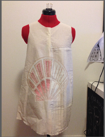
With the above embroidery placement, I wanted to place the shell in the centre half over the pleats to highlight that the pleats represent the lines inside the scallop shell. The large scale of this makes it seem more like a placement print rather than embroidery which I feel adds a contemporary vibe to a some what traditional means of embellishment and also considering this design was completed by the traditional artisans and is a very literal interpretation of a shell. The choice to use this shell, the most structured and traditionally linear of my samples was to compliment the pleats and enhance them as a fabric manipulation aesthetic feature.


In the above two images I (quite obviously) played with repeat to see how this could compliment the repeat associated with pleats. Its quite hard to visualise and I find this placement extremely intense, I feel this repeating of the sample could look more appropriate on a formal piece, with a longer line to allow a gradient to be created with the shells diminishing into the skirt or something. This placement almost looks as if the embroidery is a fabric, and would obviously seem more flat in real life, I may play with layering colour over the pleats to compliment the intense embellishment as the calico makes it hard to visualise.
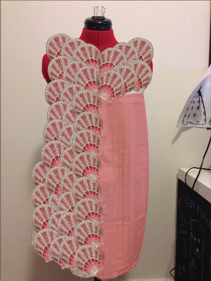
Giving the calico colour in Illustrator to help visualise…

I was most excited to play with my second traditional embroidery with this drape as I have previously done a few sketches with this embroidery in mind. Ultimately, my plan with the pleats was to compliment yet contrast the curve of the shells, yet also alluding to the lines inside a scallop shell, so I felt this very curvy embroidery would capture this idea perfectly. In the above image I used illustrator to allow the embroidery to cover a larger area and stretched it to fit vertically. This adds to the flow of line with the pleats and would help to lengthen the wearer, I love the contrast in line and movement this embroidery placement creates. Ideally the colour of the non embroidered side and back of the garment would be an off-white, similar to that of the embroidery sample’s base cloth, in a sturdy weight fabric to support the pleats and embroidery.


After completely covering one side of my drape with embroidery, creating a fabric rather than just a placement, I decided to play around with repeat and scale. I like how once again the curve of this embroidery contrasts and compliments the straight knife pleats. I also like the positioning of the embroidery near the neck line, and am pleased that within my sample I decided to have the inner lines continue to spray out from the spiral, as this looks very effective on the drapes.

With my second contemporary design I used Photoshop to remove the background of the fabric to highlight the transparency of the base cloth, and placed this over my drape. I found with this embroidery design, whilst spectacular as a sample, did not match this drape. The flowing lines coming from the shell clash with the straight pleats. I then decided to sketch and create a tech sketch of a skirt that would be only for this embroidery… I will try its placement on my second drape and see how it evolves.
